What is Big Data?
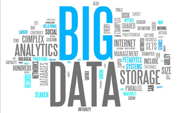
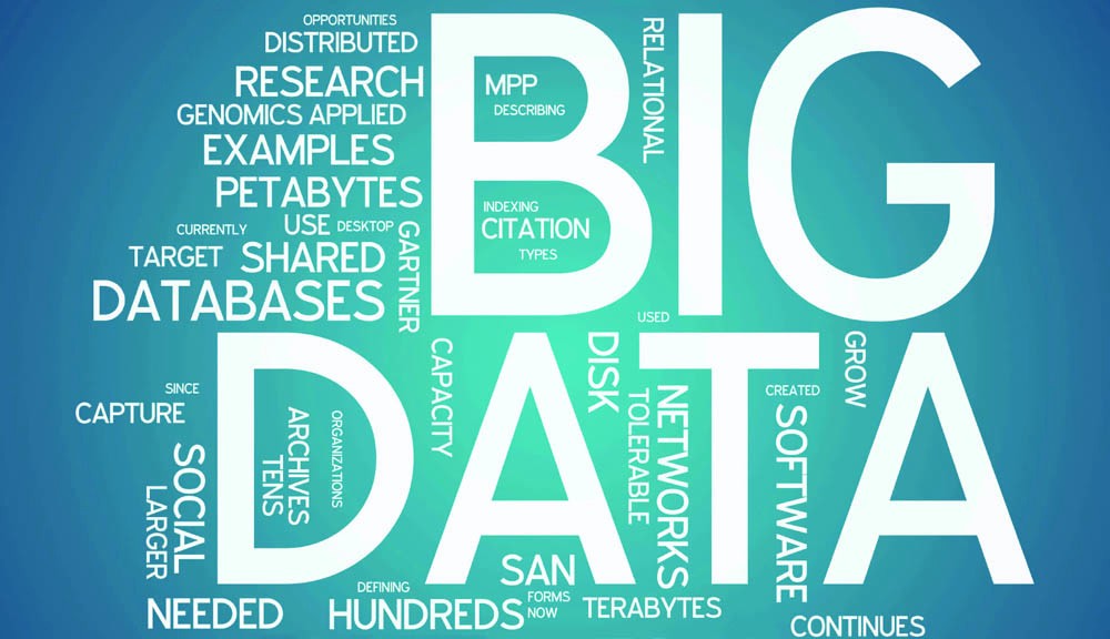
Big data is a term describing the large amount of organized and unstructured data that comes into a business on a daily basis. But it’s not really the amount of data that’s critical. It’s what companies do with all of this data that matters. Big data can be evaluated and analyzed to lead companies to make better decisions and strategic business moves.
The process of gathering and storing large amounts of data for eventual analysis has been around for a long time. It gained momentum early this century. Typically it can be described with the three big V’s:
Volume: Companies often acquire data from a variety of sources: transactions, social media, and sensor or machine data. Recent storage breakthroughs have reduced the problem of storing this data.
Velocity: Data comes in at an amazing speed and should be dealt with in a timely manner. RFID tags, sensors and types of smart metering are making it necessary to deal with the data in near-real time.
Variety: Data comes in all types – from structured, numerical data in databases to unstructured text documents, email, video, audio, and financial transactions and market data.
What is Data Visualization and Why is it Important in SEO?
The concept of data visualization for SEO is the representation of data in a pictorial or graphical format. This allows companies to see SEO analytics presented visually. It’s easier to grasp difficult concepts or identify new patterns. With types of interactive visualization, one can use technology to investigate charts and graphs for more detail, interactively changing what data you see and how it’s processed.
Humans often find using charts or graphs to visualize large amounts of complex data is easier than poring over spreadsheets or reports. Data visualization is a useful way to convey concepts in a universal manner. One can also experiment with a variety of scenarios by making slight adjustments.
Data visualization can help in SEO:
How Does Visualization of Big Data Help in Interpreting SEO Information?
Multiple Analysis Viewpoints
Traditionally, SEO information based reports often consist of charts and tables that do not clearly detail critical information. Reports made using interactive visualization, show large amounts of data in a way that can summarize vast processes using rich graphical representations.
Benefit One: Consolidating a Large Body of Information
Effective SEO analyses present information in a way that allows people to understand information that is of particular value. Interactive data visualization technology is an effective tool for investigating hidden facts and new concepts. It requires the gathering of large amounts of related and unrelated information consolidated into a useful format.
Benefit Two: Freedom to Explore Big SEO Data
Doing research on an unknown large body of information can prove challenging for anyone. Analysts need a way to understand the details involved with the real-world application of a particular dataset. Interactive visualization tools provide analysts with easy to understand interfaces that facilitate the ability to manipulate information in ways that are meaningful to the user.
This is especially critical for SEO when analysing information from different websites. While the domains differ, they may share policies such as determining data validity and hiding or disclosing certain details. However, the domains might work with similar information such as keywords and backlinks.
Benefit Three: New Tools for Leaders
Interactive visualization technology can change the way that people view enterprise and operational SEO data. Static analyses only reveal part of the story. Interactive visualization is an innovative business language that allows interested parties to ‘see’ the data.
While static reports do provide some useful data, to get a better understanding we need more in-depth information. With interactive visualization, we can create actionable SEO data from information stores one could never hope to evaluate using traditional data visualization techniques.

Is Excel a Data Visualization Tool for SEO?
It’s important to define what we mean by ‘data visualization tools’ so that we have a standard for comparison. We need to understand what the architecture is of data visualization as a process. Data visualization has six important purposes:
Excel is weak in some of these areas behind some open-source visualization tools and enterprise solutions. Excel is a great ‘spreadsheet-based data tool”. But it is not the best ‘data visualization tool.’
Which Data Visualization Tool is Best for SEO?
Not all of the data visualization tools are created equal. You’ll realize they also tend to focus on different aspects of data interaction. To find a solution that will really meet your needs, you need to evaluate your selection carefully in terms of features and capabilities.
Which tools are supported?
Check into the kinds of visualizations a tool supports. Compare that not just with the kinds of data you expect to collect, but with how your company might like to receive that data. Companies have often standardized on a certain method of looking at their key data. Make sure a tool can analyze the data that way, and take the chance to see some new visualization methods. You may find that a new view unlocks new viewpoints.
Which Data Formats are supported?
Find out which data formats the query tools supports. There should be a long list that includes not just basic data formats such as SQL and NoSQL databases, but also specific apps such as Oracle or SAP Financials, sales tools such as email marketing platforms and customer relationship management (CRM) apps, and similar business platforms. If you’re considering a move into Big Data processing, then support for Hadoop is critical. Hadoop is Apache Software Foundation’s open-source Big Data framework that processes large amounts of data on clusters of servers.
Can the Tool Drill Down on Data?
Also, examine whether the tool can drill down on all of that source data. What actually is required to drill down on data beyond first-tier querying? Can the tool drill down on a live data visualization? For some organizations, that can be an invaluable capability because it lets people effectively change the story a given visualization is telling immediately. Does a “re-querying” of this kind require SQL or does it use the same natural language syntax as a first-tier query? Remember that the graphics one builds with these tools aren’t simply pictures, they are intended to be live, visual windows into your business. Being able to quickly and easily adjust that view can be critical to realizing a tool’s full value.
What are the Exporting Capabilities?
Examine the exporting capabilities. Once you’ve built your query and visualization in the tool, what are your options for exporting it to where other folks can consume it? Key options here should include not just a variety of flat graphic formats (i.e., CVS, JPEG, PDF) but also code snippets that can be dropped directly onto webpages, incorporated into other apps via open application programming interfaces (APIs), and rendered in the best way possible on both desktop and mobile devices.
What are the Advanced Processing Capabilities?
If you are collecting Big Data look at a product’s advanced processing capabilities. Some tools act mainly as querying front ends for back-end stored data that is intended to do most of the processing your queries require. This can be difficult if the stored data is under a constant query load already, and it can be downright impossible if your queries will span data sources outside of the data warehouse. In such situations, the data tool will need to analyze your query’s numbers This means support for advanced data processing capabilities can be crucial.
Choose Visualizations Carefully
Data visualization might be considered the prettier face of data analytics. It doesn’t change the numbers or the questions, it simply gives you more ways of looking at them. This is invaluable for some organizations but completely unnecessary to others. If advanced analytics is what your organization needs, then evaluate self-service data tools based more on their number-crunching capabilities than on their visualization features. But if you’re trying to bring an easier view of all the data your organization is collecting to a wider group of people, then data visualization is of prime importance. Just remember that not all people understand all images easily. People learn and interpret information in different ways. Know your audience and choose visualizations that work best in communicating with that audience.
How Much does Data Visualization Cost?
The license cost for buying data visualization tools is not the important part of the cost. The real cost is in getting talent that can run the tools effectively and produce clear reports that other team members are able to understand. In other words, as long as the talent is knowledgeable with one of the top tools, then that is the best tool for you!
Conclusion – What are the Limitations of SEO Data Visualization?
Big data is estimated to double in volume every 1.2 years! Data visualization is a powerful tool to show trends and represent simple data but how can you explain the results of complex analysis of big data or predictive or prescriptive analytics? What are the limitations of data visualization?
Data visualization tools really help to represent data results in pictorial/graphical formats. And while data visualization tools are meant to help us see trends and understand data, there are significant limitations that can become problematic as data sets grow. The top limitations of some conventional data visualization tools and solutions to those problems.
While data visualizations can be generated easily in real-time, they do not provide any explanations. The process through which we draw insight has not changed in many decades. We look at data and then write reports. This process is too slow for our fast paced world and too costly for most companies. Data visualization tools require the user to be an expert in all of the data and all of the best practices.
Different users confronted with the same data visualization may not necessarily draw the same conclusion, depending on their previous experiences and particular level of expertise. This presents several problems for us. Users could be incorrectly drawing conclusions which cost money and on the other users’ incorrect conclusions could actually put their company at risk.
What if the user analyzing the data lacks expertise and/or training? Mistakes could be made that affect an entire company. Also, analysts could provide clients with incorrect or substandard advice. The industry trend is towards big data, and complex analysis. You might not even know what you don’t know!
Graphics are great for conveying simple ideas fast! However, if words could be replaced by graphics, they would have been a long time ago. To express a complex situation, sentences and phrases are required along with a system that is smart enough to articulate its reasoning process. Importantly, language also makes sure the end user really understands. Graphics can make users think they are making data driven decisions or think they fully understand the data when in reality they are only seeing a picture but they don’t know the full story.
